Some hints for completing your homework:
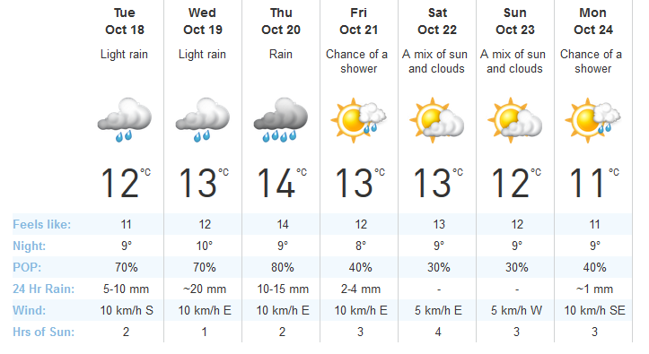
1) The High Temperature is the number in the biggest font, directly below the weather picture for each day.
2) Average Temperature means you add up all the temperatures and divide by the total number of temperatures (7).
3) For your Double Line Graph, make the High Temp in one colour, and the Low Temp in another colour so we can tell them apart!
 RSS Feed